Redesigning The Onboarding Experience To Align With User Needs, Increasing The Completion Rate
The onboarding experience of the app required identity verification, which for the user was too much effort, due to various reason I'll detail. This is a story about how I collaborated with the team and founders to improve the onboarding.

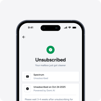
THE CHALLENGE
The verification of identity step was a big friction point for the users onboarding on the app, they did not have enough motivation to do it as the need of the users were not aligned properly with the product, which resulted in a significant drop off rate on that step.
THE SOLUTION
Worked closely with the stakeholders to redesign the onboarding experience, realigning it with user needs and expectations, resulting in an onboarding completion rate of 88.89%.
Note: Early post-launch data
PRE-LAUNCH
How the story started - What we had assumed
We had assumed the number of steps were unnecessary and could be condensed, and assuming that the length of the onboarding might become a problem and lead to users dropping off.
HERE'S THE PREVIOUS FLOW
- Get started
- Enter your address
- Select your paid postage potential
- Auth
- Your name
- Your relationship to the property
A slight tangent
Meanwhile I was also tasked with creating a webapp version. Where I took the opportunity to merge a few steps. Although this flow was not adapted to mobile we figured out maybe we could test which onboarding might perform better.
HERE'S THE SLIGHTLY ALTERED FLOW OF WEBAPP
- Get started
- Enter your address (Shows paid postage potential)
- Auth
- Your name & Your relationship to the property
Reducing to 4 steps from 6.
In summary, we had assumed pre-launch that the problem with our onboarding might come from the number of steps the user has to go through.
POST-LAUNCH
After the product launched, the users started dropping off, why? Well.. there are a few reasons for that.
We were expecting some users to drop off due to length, which was a factor but we found out there were other factors contributing to it as well.
BUSINESS FACTOR
After pushing, we realised the user need was something else, restructuring the business and product from digitalization of physical mail as being the USP to getting rid of physical junk mail in the US.
LACK OF MOTIVATION
With the need of the user not aligned already due to business factor, and with the already somewhat lengthy process and the final nail in the coffin for drop off was the identity verification screen for the user.
HERE'S WHAT WE KNOW
In summary, the commitment asked to verify identity at the last step was too much for the user, since they already had lack of motivation due to need misalignment which led to them dropping off.
ITERATING - ITERATING
Attacking the problem from multiple angles.
From founders' side they realigned and changed the business model to be more in line with user needs, and from product side, we worked on redefining the user flow of the onboarding.
FIXING BUSINESS FACTOR
Users genuinely reported feeling overwhelmed from the physical junk mail they are receiving and wanted them to stop.
In USA, an average person receives 300 junk mail per year.
I looked online and there are multiple reddit posts, petitions and guides from people to stop the junk mail-
"The USPS is just spam at this point." -reddit user
"Deleting from emails is so much easier because I can easily click the Unsubscribe button. How do I stop receiving so much BS physical mail???" -reddit user
And founders also gathered opinions of people informally, and decided to pivot to getting rid of junk mail as the main USP.
FIXING USER EXPERIENCE FIRST DRAFT
With this pivot meant, looking at our competitors in this space, we could allow users to skip the verification. Me and the mobile dev sat down and quickly conceptualized the flow together with Ekaksh [Mobile engineer]. The new flow was ready in a day.
In summary, with the change in business USP, we were able to reduce the steps and add a skip button while verification.
THE ENDGAME
The First draft still had a few issues.
As we had quickly iterated the redesign, just to ship, I knew the narrative and context could be better of the onboarding.
NARRATIVE AND CONTEXT ISSUE
The new copy and the narrative of the onboarding still lacked in clear communication and having clear narrative of unsubscribing from junk mail, across the onboarding.
Breaking down the design decision
1. COHESIVE NARRATIVE ACROSS ONBOARDING
Changing the copy of button from "Claim Address" to "Start unsubscribe" uses outcome priming. Leading with the user's desired end state (no more junk mail) rather than an abstract action("claim address") immediately answers "what's in it for me?"
2. ADDING ANIMATION TO MAKE THE USER FEEL THE PROGRESS
Adding animation which made the user feel like something was happening, giving them a little inertia to move forward in the step.
3. USING INERTIA BUILT TO DIRECT TO ACTION
While we had added the skip button, it still would be best for us, if we could verify their identity, which was required to access other features of the app, wording it as "Final Step, Confirm Your Unsubscribe Request" using zeigarnik and sunken cost fallacy, the users are primed to move forward rather than skipping.
THE OUTCOME AND LEARNINGS
Onboarding completion improved from ~63% to ~88% post launch of the new onboarding.
While the data is early post launch, still the improvement is clear, stakeholders understand the flow more clearly as well.
THE LEARNINGS
The challenge was interesting, seeing how much intertwined the business and the ux is, how one affects the other.
An interesting pattern emerged, we didn't see many people skipping.
People opted for completing the verification when it mattered to them, when the product clearly communicated that "you are at the right place" early.
Animations can play a huge role in keeping the users engaged even though it might increase the time of onboarding, if the user is likely to only see it once, and it shows real progress instead of a gimmick, then they can become a real powerful technique.
I appreciate you giving the time to read this.
Hritik Sharma
Product Designer crafting clean UI/UX & Motion for startups and product teams.
Responses (0)
Anonymous
No responses yet — be the first.